The Market’s Altimeter: Yield Curves, Spreads, and Economic Signals
Are yield curves and spreads still reliable recession signals?
"The only function of economic forecasting is to make astrology look respectable."
- John Kenneth Galbraith
To say I have disdain for economic forecasts would be an understatement. The economy is too complex, with too many moving parts, and too many irrational decision-makers, to predict with certainty.
But I’m not here to talk about forecasting. I’m here to talk about hiking 🥾
If you’ve ever climbed a mountain, you know how important it is to track your altitude. The tool for the job? A gizmo called altimeter.
An altimeter tells you how high you are, but not which direction you’re heading or how close you are to the summit. It’s a useful tool, but you must understand its limitations.
The yield curve and yield spreads function the same way. They don’t tell you exactly when a recession will hit, just like an altimeter won’t tell you when you’ll reach the summit. But they do provide critical context for where we are in the economic cycle.
Today, we’ll explore how these signals have changed—and whether they still work in an economy reshaped by private credit.
🔎 On Yields, Curves, and Spreads
First things first, let’s outline what we are talking about. Feel free to skip this section, if you are well-versed on these terms (but please vote in the poll below).
Yield: the return on an investment, typically expressed as an annual percentage. For bonds, it represents the interest earned relative to the bond’s price. For example, on 3/24/25 the yield on a 10-year Treasury is 4.327%, while a 2-year Treasury has yield of 4.032%.
Yield spread: the difference between the yields of two bonds, often used to compare risk levels (e.g., 10-year Treasury yield minus 2-year Treasury yield).
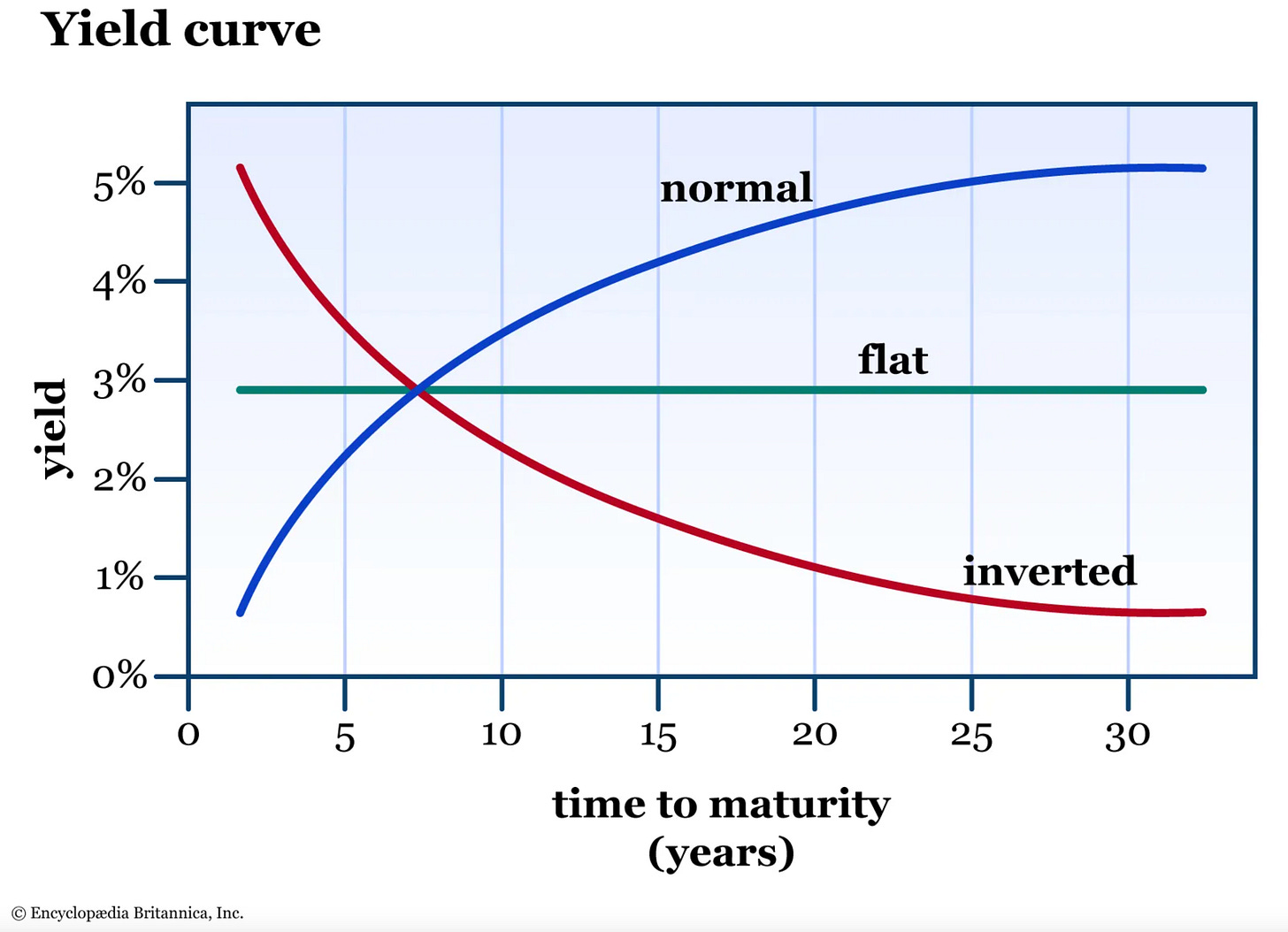
Yield curve: a graph showing bond yields across different maturities. A normal yield curve slopes upward, while an inverted yield curve slopes downward.
If you are paying attention, you’ll be able to answer this based on the info provided earlier:
Now, let’s put together two key pieces of the puzzle.
You’ve likely heard that an inverted yield curve signals a recession—that’s one part of the story. The other is what yield spreads tell us and how their significance has shifted with the rise of private credit.
As always, you’ll find all related articles linked at the end 📚.
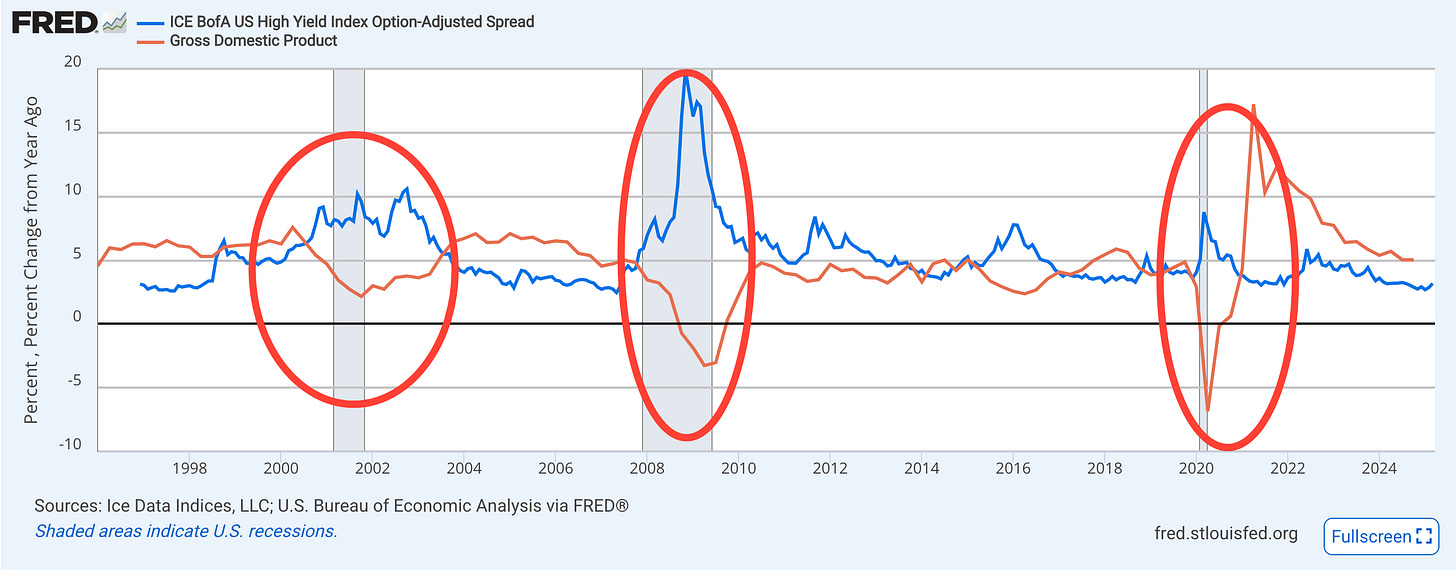
‼️ Before we get going, take a close look at this chart. Shaded areas are recessions, blue line is the high yield spread, orange line is the percent change in GDP (gross domestic product). Notice any patterns? Let’s dive in.


